There and Back Again:
A College Student's Tale of Tutorials
Get Your Data Visualization Game to the Next Level with Datawrapper
In the realm of data science, presenting insights in a visually appealing and digestible manner is crucial. We all our statistical softwares because of their robust abilites. But what programs like python and R have in power they lack in style. It’s not just about numbers; it’s about telling a compelling story that resonates with your audience. This is where Datawrapper steps in, empowering data scientists to create stunning, informative graphics effortlessly.
Step One: Signing Up & Uploading Data
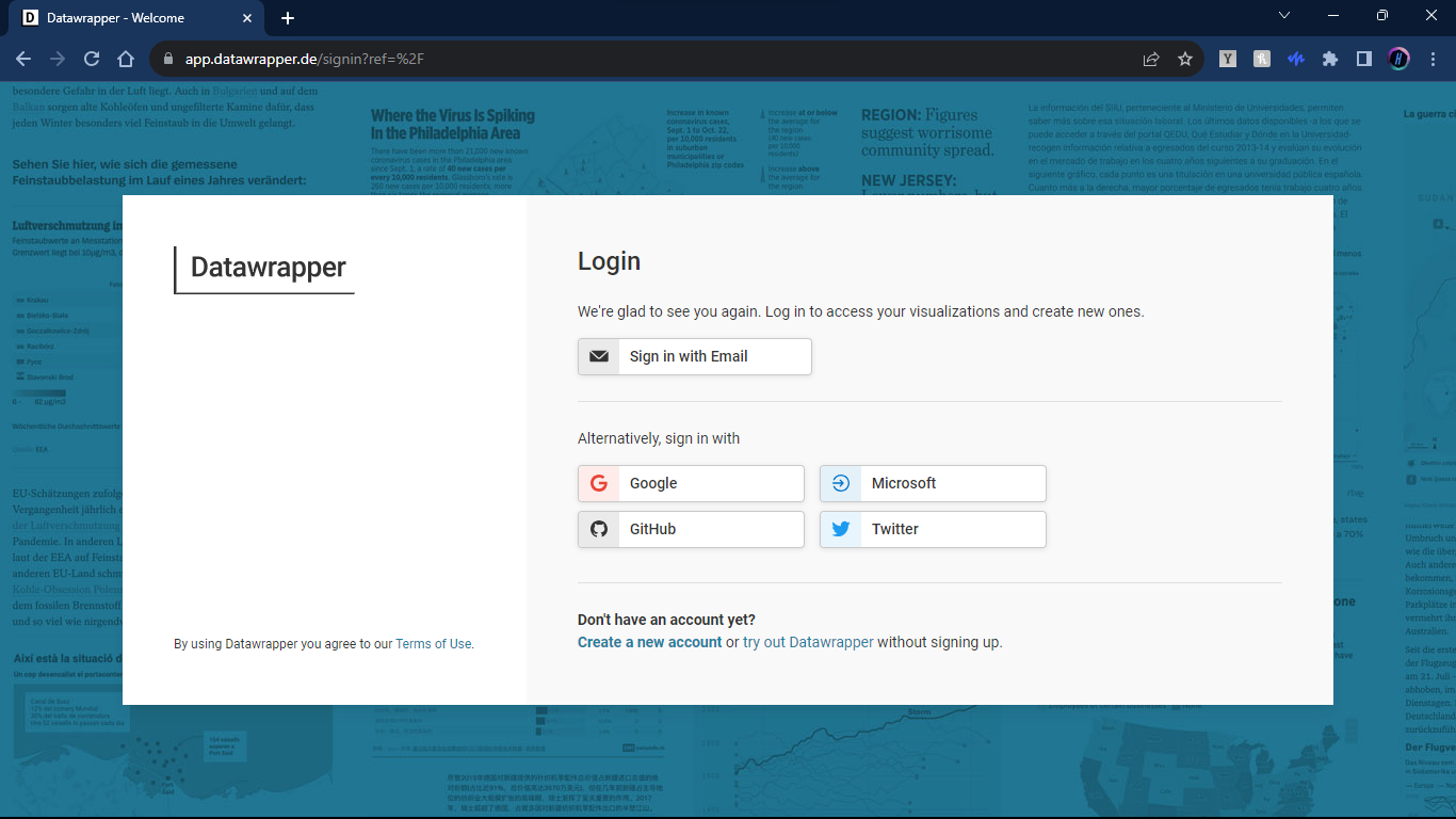
Signing Up
This is straight forward, sign up or sign in by whatever method suits you. You will notice that signing up and using datawrapper is completely free! There are some premium options that are available should you need the benefits they provide. After signing in we can begin to use the magic of Datawrapper.
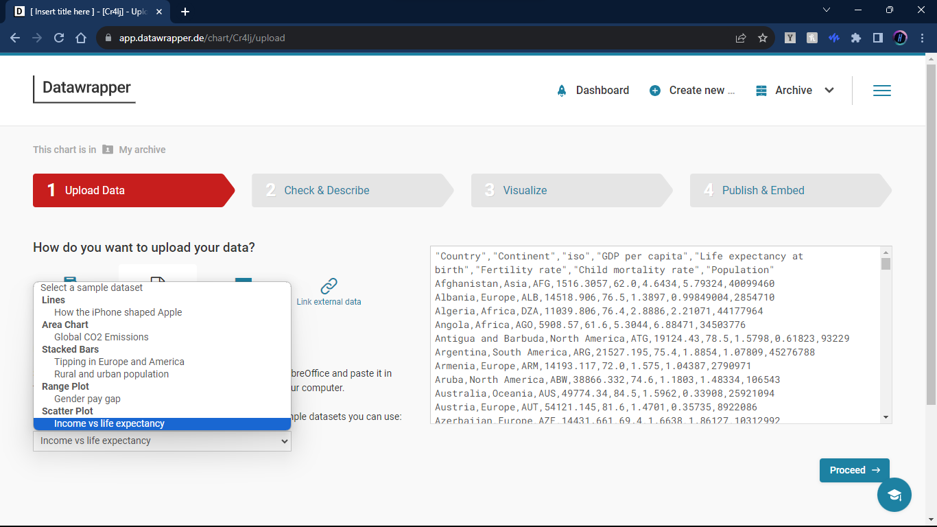
Choosing/Uploading Your Data
Once you are signed in, we choose to create a NEW graph, and it will take us to a screen that looks like this:
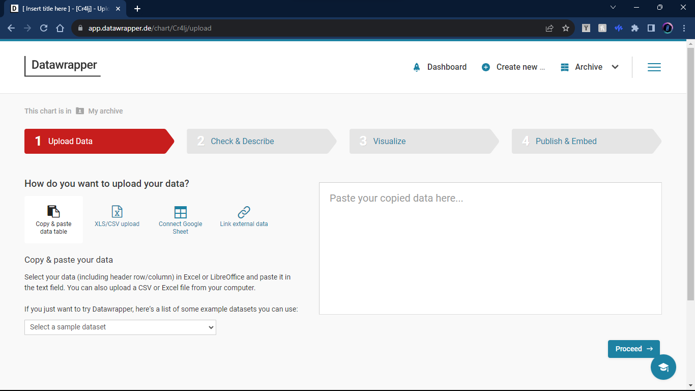
Here we can choose a variety of different ways to upload our data. For this tutorial we will use the Income vs. Life expectancy data set that they provide.
Step Two: Check and Describe
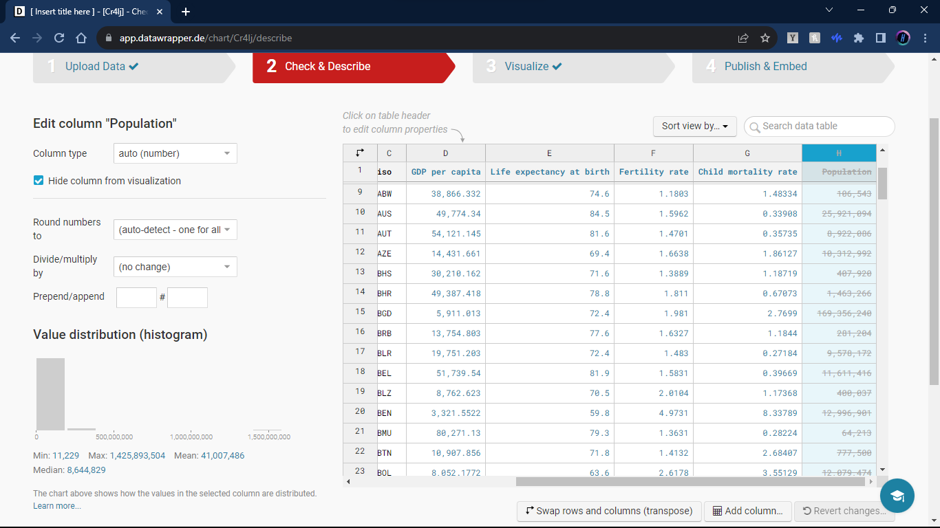
Check the data
Now that we have the data loaded we should double check to make sure the data looks right and includes the information we want. There is a lot that we can do on this page like restricting variables to a range, checking variable distributions, and more. But if you know your data is good to go, this is more of a formality.
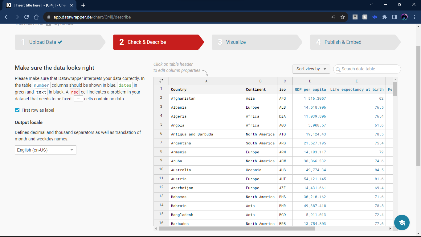
We can also choose to exclude parts of the data to make graphic creation more streamlined. In our case, we will exclude the population column.
Step Three: Visualize
Choosing the Chart Type
Datawrapper offers a wide array of chart types. From classic bar charts to intricate Sankey diagrams, depending on what you want to convey, there is sure to be an option for your needs. Continuing with our example, we will use a scatter plot.
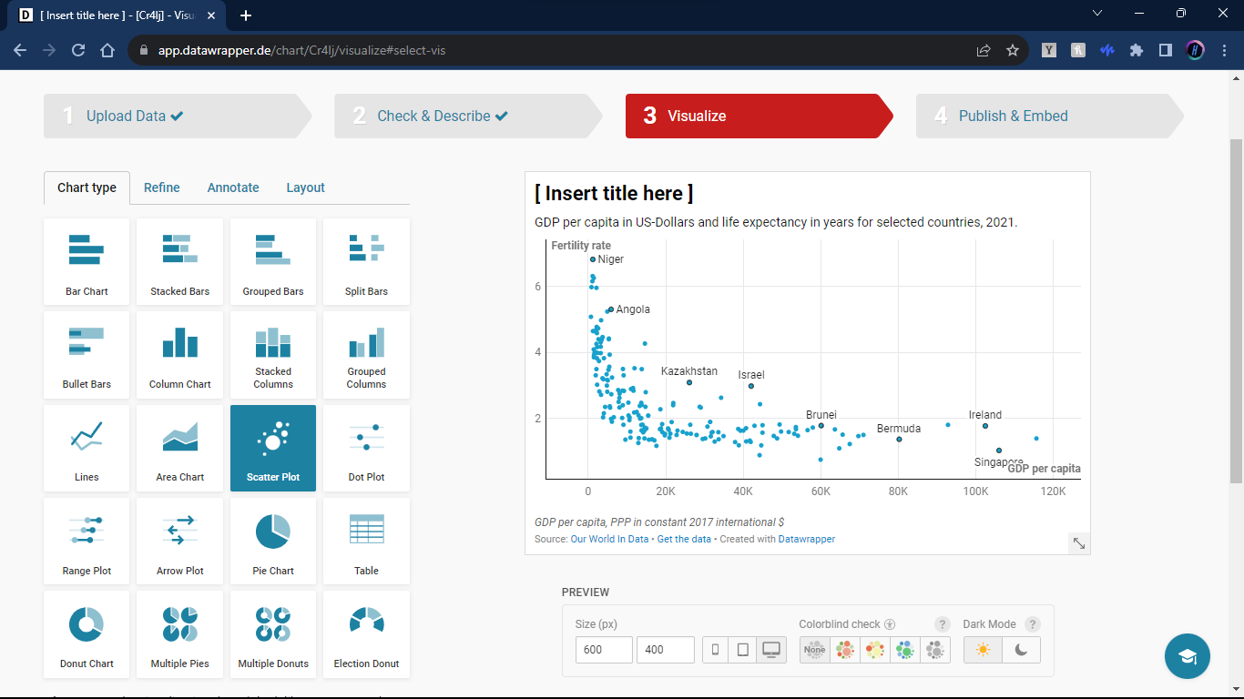
Also, be sure to name your graph!
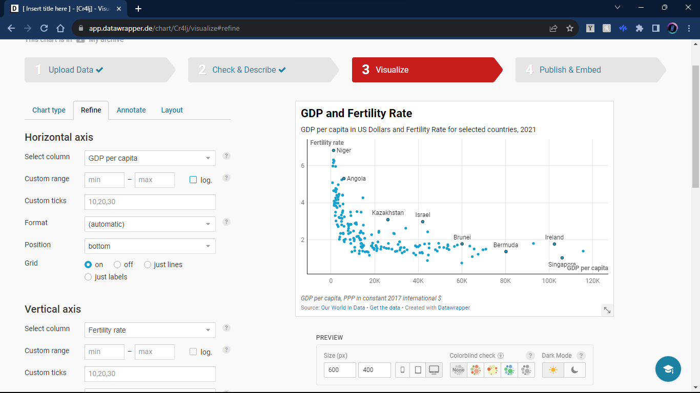
Refine
Now we decide what variable we want on the axis. The options will be all the columns that you decided to include in your data set from step two. Lets set GDP as the horizontal axis and Fertility Rate as the vertical axis.
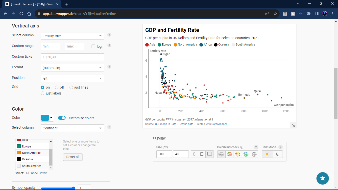
Additional Variables
Even with two axis, we can convey information about multiple variables at the same time. Lets do this with color. Find the “Customize Color” switch that looks like this:

Now we can choose another variable to convey on our graph. We will pick colors for the different continents that the countries are in.
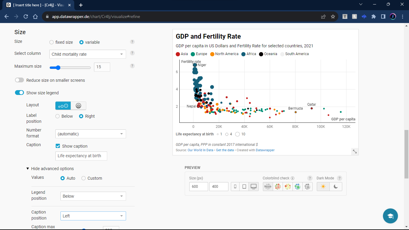
We can also choose size as a way to convey another variable. Lets choose child mortality rate for this variable. (Be sure to label the caption correctly, unlike me!)
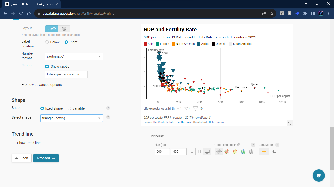
Shape is also an option to convey yet another variable. For this tutorial we will change the shape but not attribute it to a variable.
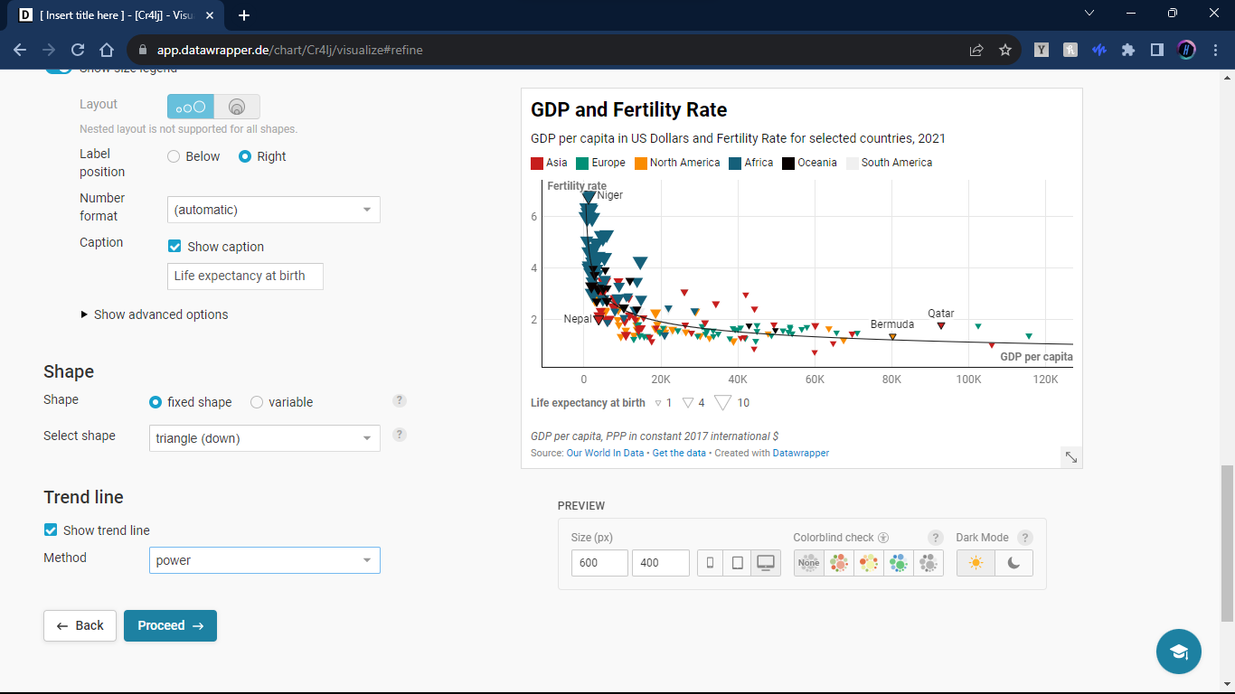
Lastly, we can choose to show a trend line that best fits the data. The calculations are done automatically with the columns you chose as the x and y axis, all we have to do is choose what line would work best. In this tutorial I selected the power trend line.
Ensuring Accessibility and Clarity
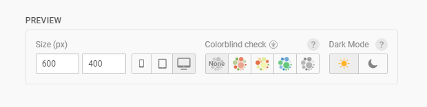
A great thing about Datawrapper is the ability to create inclusive visuals. People with visual disabilites can find many visuals hard to understand. For example, below your graph-in-progress there is a selection that allows you to see how your graph would look for various people with visual diabilites.
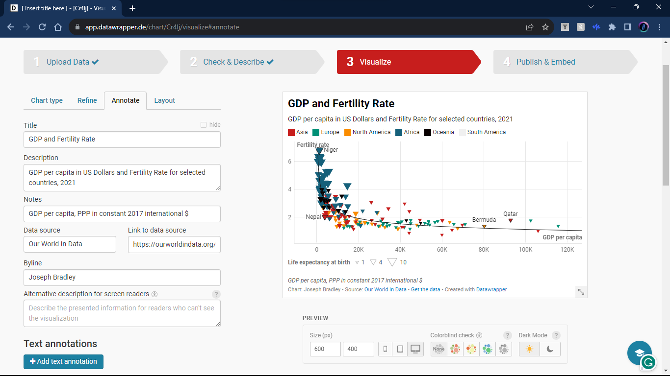
Annotate
In the annotate section here we can add alternate description to our graph so that blind people can also have a web reader tell them about the graph we made. It is also here that we edit the general description, title, source, claim authorship, and provide access to the data we made the graph with.
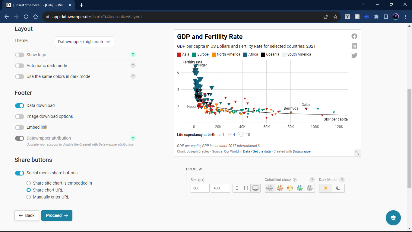
Layout
In layout, we can choose a theme for our graph. In our example I chose the high contrast theme.
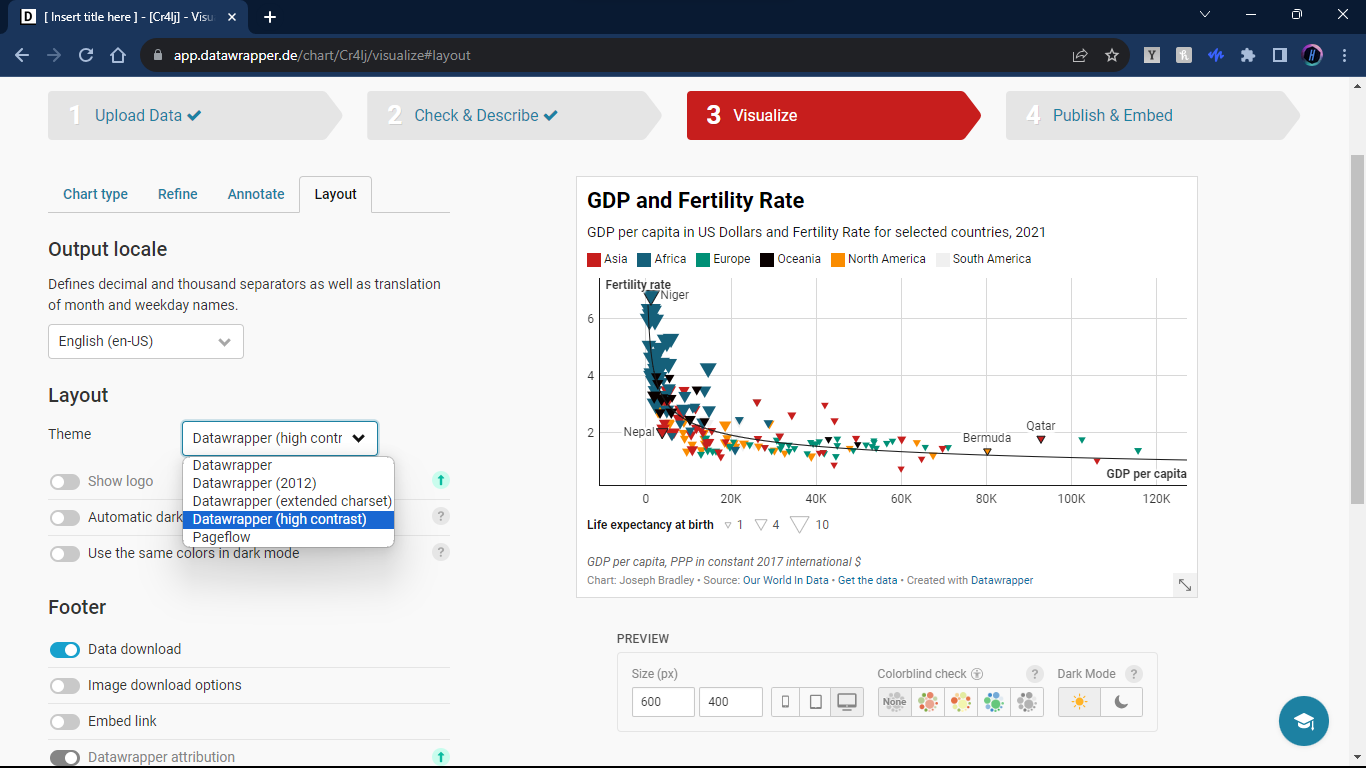
It is also here that we can choose to allow links to the data to show up on the graph. We can also have social media sharing links for quick sharing of the graph.
Step Four: Publish and Embed
Now we have nearly reached the end of our graphic creation journey. One of the last things we need to do it publish our graph. Since we have an account, it will be placed on our account’s dashboard after publication. If we do not publish we cannot share our graph in all of it’s glory.
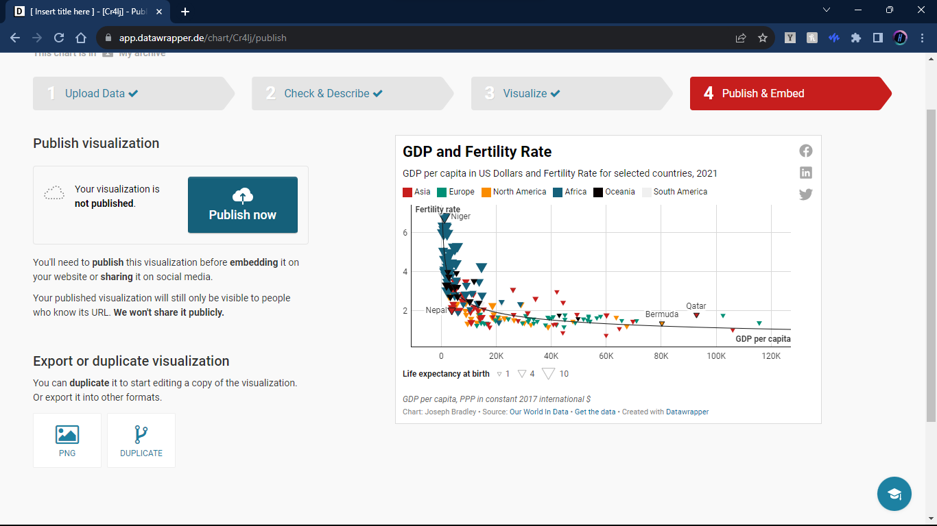
After we publish, we are now able to more effectively share our graph. We are provided a link and code for embedding into websites or markdown files.
And that is it! We made our graph!
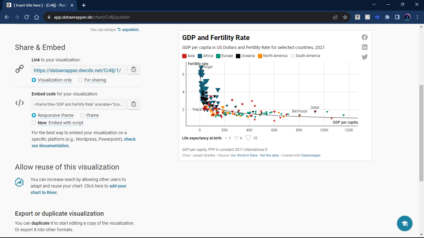
Look at the graph we made!
It is embedded into this blog post and completley interactable! (I made a few changes to some errors, but it should generally look the same)
Conclusion
As data scientists, we love our data. We spend hours cleaning, manipulating, and working our data. We have amazing tools to help us do that. Unfotunately, those tools are not optimized for visualizing our data. Datawrapper is just one tool that is better suited for visualizing your data than R or Python. It is simple, straightforward, and can elevate your visualization game. Impress your coworkers, boss, and loved ones with the interactable graphics that you can now create.
So why wait? Head over to Datawrapper, sign up, and start turning your data into engaging narratives today!
Happy visualizing!